
Electronic sell-through (the ability to purchase video content) through DISH was an exciting opportunity to add a new revenue stream while adding value for customers. So how might we create a frictionless purchase experience for numerous types of content like single movies, movie collections, single TV episodes and full TV series. Meanwhile, with the latest DISH On Demand redesign we had a more fractured 10ft experience and a need to bridge the old and new experiences.
As Lead Product Designer I was focused on a simple experience for users, while blending new parts of an ever changing UI with legacy portions. I was responsible for all iterations of User Interactions, UX/UI Design and Information Architecture. I collaborated extensively with my UX Research partner on all research, test plans, and test execution.
Collaborating regularly with the Director of Product, Product Managers and Engineering through stakeholder interviews and regular touchpoints we distilled and focused on these major goals.
1: Increase On Demand revenue through purchases
2: Balance UX & Engineering Time/Resources
3: Create a simple and usable path to purchase
4: Build consistency in a fractured system
5: Optimize purchase entry points and funnel
Since this project covered all content purchases within the DISH system, it had quite a broad scope. This case study focuses on the design for purchasing Movie Collections or bundles. The learnings from this first project laid the foundation for numerous other purchasing projects.

Let's just admit it, design is a complex and messy process that doesn’t always fit into a neat little graphic. I loosely structure my highly flexible design process for all products around Discover, Design & Deliver. This framework, popularized by FROG Design, While the individual techniques vary from project to project based on timelines, resources available and more, I know this simple framework can support complex projects with constant collaborative iteration or be a minimal framework for more linear fast moving projects.
Since this was a fast paced project with tight timelines and a heavy focus on usability, the process included the following tactics.
- Competitive Audit
- User & Stakeholder Interviews
- Personas
- Wireframes & Low Fidelity Testing
- User Flows
- High Fidelity Prototypes
- Iterative Usability Testing

I completed an extensive competitive audit to understand 2 key things.
1. What are the established UX patterns in the market today for purchasing content?
While we want to innovate, we also want to understand current industry conventions and how leveraging those familiar patterns can help users easily learn our system and complete their task. What we found is a huge variety of ways competitors promote purchasable content, the options they allow users to buy and whether or not they autoplay content after purchase. One industry standard used everywhere is that content for sale is aggregated with a provider’s On Demand rental content so users can find a piece of content and all purchase and rental options are available together. This aligned with our earlier discussions with customers and how they view content.
2. What are our competitors doing right and where might users struggle?
I completed a heuristic evaluation for 3 of the largest video content providers that allow purchasing content. Evaluating their video purchasing process in depth allowed me to understand some of the challenges users might face and how some of the top services are mitigating these issues. This evaluation showed from a heuristic standpoint that the main competitors in general had highly usable systems. Only one competitor allowed purchases without a confirmation from the user. This was possibly concerning from an Error Prevention perspective. Also, there was a high variability of how the services surfaced content prices to users. While surfacing prices sooner can be viewed as building trust and being open about pricing, it can also be seen by some users as unnecessary in the browsing experience and goes against minimalist design. So how might we strike the right balance?
User interviews were conducted in conjunction with our new On Demand redesign efforts. Questions were asked around rental and paid On Demand content. 1-on-1 interviews were conducted with a mix of 15 DISH customers and non DISH customers. From these interviews
Takeaway 1:
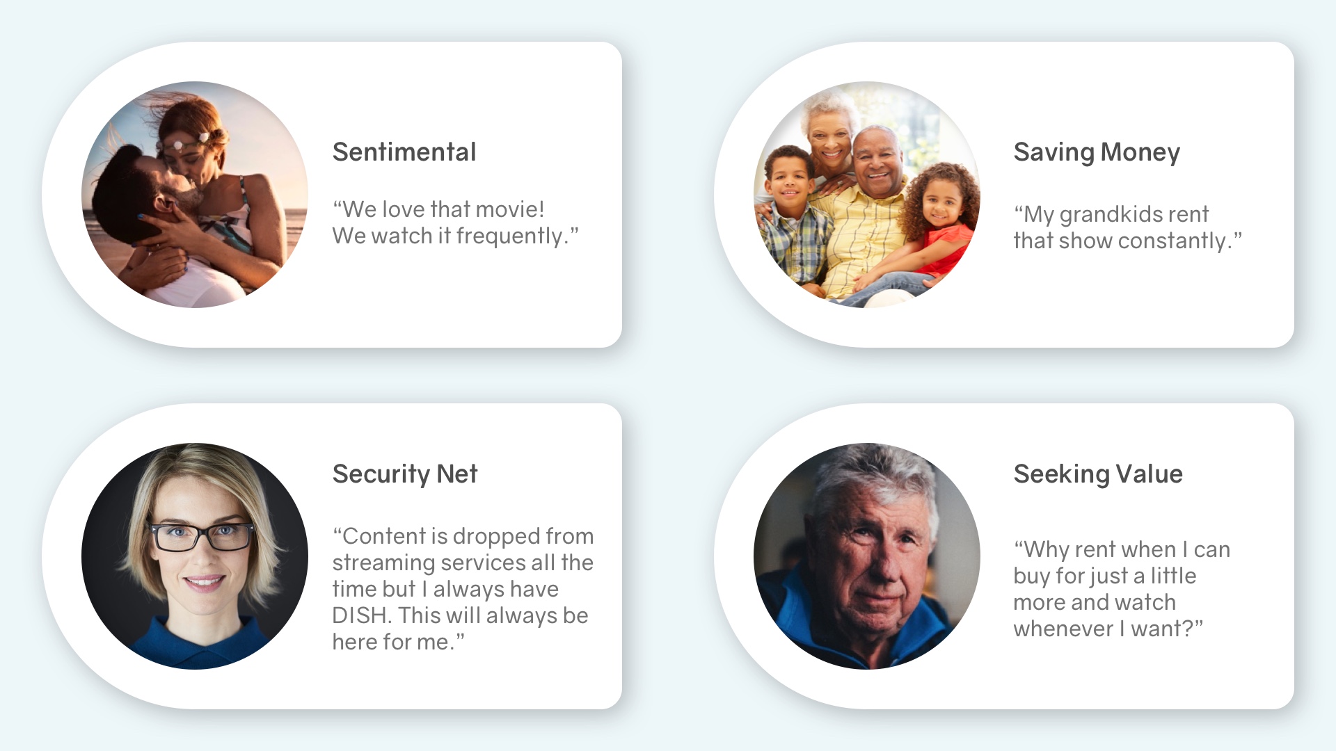
One of the key takeaways for purchased content were the emotional drivers and the value decisions between renting content once, versus purchasing.
Takeaway 2:
Even though users were more likely to buy collections of movies they've seen before, they still wanted easy access to basic info, like release date and rating, as well as the ability to watch the trailer. The ability to watch the trailer easily, dramatically increased the willingness to purchase, especially amongst those with sentimental connections to content.

We sometimes joke that DISH has a user base as broad as a barn door. Our customers reach every age and description so detailed personas often aren’t as helpful as one might think. Designers often get lost in designing persona artifacts and not the experiences and outcomes for those users. We need to be more agile than that, so these emotional drivers served as our distilled personas. There’s no ASL here, no fluff, just the high level drivers for customers purchasing content instead of renting.

Early versions of the Collections Purchase did not have its own, highly visible shelf in On Demand. Entry to purchasable content was extremely contained within the Buy/Rent screen for a single movie in the collection. This was initially advantageous due to ease of implementation as we would see later, not easy to discover or understand.

Simple, clickable prototypes helped us discover numerous issues to iterate on and improve the experience. Version 1 and 2 of the Collection/Bundle cross promotion and entry point in the Rent/Buy screen are shown above.
Version 1 Test & Findings:
Version 1 simply added Single Purchase and Collections Purchase access within the current rental screen. Users often didn't see the “Available in Collections” button. They were also confused by the term Collections and multiple mentioned the word "Bundles" or "Box Set" as better options.
Version 2 Test & Findings:
Version 2 leveraged shelves with titles much like our On Demand layout uses. This allowed us to simplify the buttons with less repetitive text and add a full shelf of Bundles or Collections the movie was a part of. The Bundles were much easier for users to find and understand but the versions 1 & 2 were both seen as cluttered, with too many distractions.
Overall, this cross promotion between single movie and movie collections did not test well with users.Users found the Rent/Buy screens in both of these versions to be too dense, complicated and difficult to fully understand. We started to see users having a "Paradox of Choice" in these versions, leading to less task completion. Due to this, these entry points were scrapped for now and pushed us toward the simpler content shelf access model.

Again using simple, clickable prototypes we were able to test early versions of the Buy Screen without much time to build a high end prototype. Version 1 and 2 of the Collection/Bundle Buy Screen are shown above.
Version 1 Test & Findings:
Version 1 used metadata in the top left like our On Demand system and a simple shelf of the included titles. This may have been over simplified for some of our testers as it was difficult for them to understand at first. Users also wanted to easily access trailers for each individual movie from this screen.
Version 2 Test & Findings:
Version 2 again used the shelves approach with simplified buttons. It also shows the Bundle artwork which helped some identify this as multiple movies. Still, numerous users prefered the clarity of the current, larger Rent/Buy buttons compared to these simplified ones. Most users still wanted to access trailers easily and be able to review a small amount of metadata about each movie while browsing here in the screen. This version still sent users to individual movie info card screen when selecting on the movie image. This pushed them out of the buy funnel and into browsing and discovery loop.

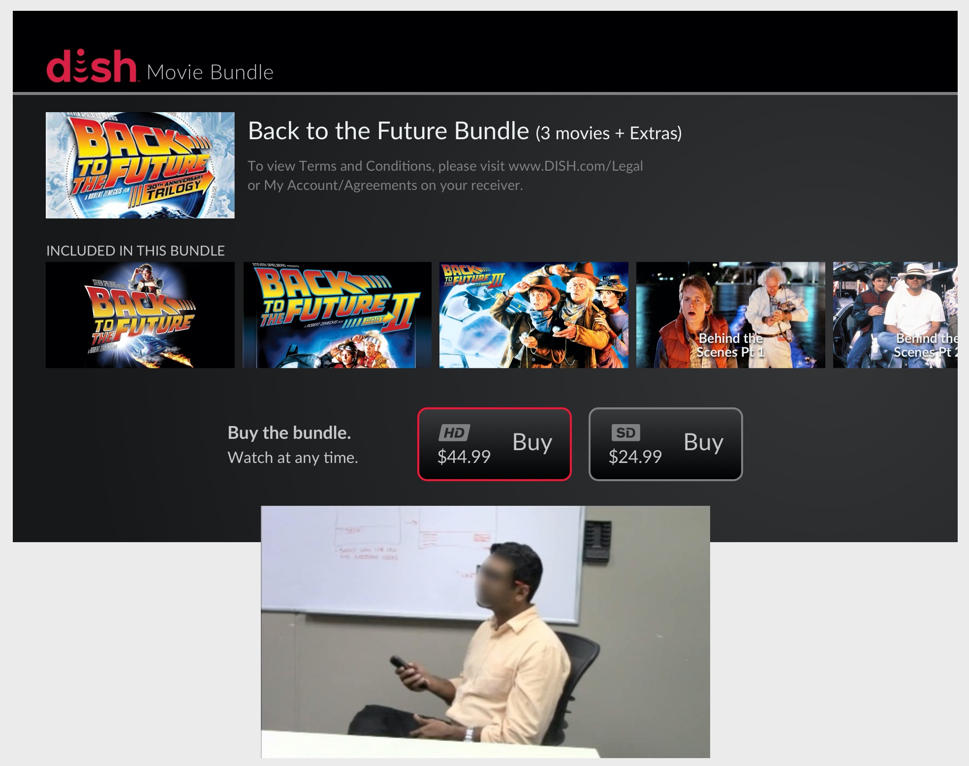
Based on the findings from low fidelity testing sessions I refocused the purchasing flow for consistency, simplicity and meeting our user's expectations. For the final high fidelity prototypes we ended up building Version 2 and Version 3 to compare. Both had full remote control functionality, and were created by our resident expert. For Version 3 I reverted to a consistent button style, and allowed individual movie highlighting and access to trailers. Overall this version tested well and with a few final tweaks would end up being the basis for our final design. Through our extensive high fidelity testing of versions 2 & 3, we confirmed much of what we had previously seen and confirmed Version 3 was the best of the all three.
Through high fidelity testing we confirmed:
1: Users prefer to autoplay content post purchase with single movies or episodes but not for purchasing movie collections & TV seasons.
2: Cross promotion was not worth the on screen clutter and confusion.This confirmed our earlier finding that selecting a movie card would show the trailer and not push them out to of the buy funnel and into another movie info card screen.
3: Individual access points and flows are the simplest approach. Again confirming these bundles should have their own shelf in On Demand and not simply be tacked onto individual movies.
4: Individual movies within a collection still need some detailed info and access to trailers, much like we had seen early interviews.
5: Our chosen final direction had an 82 SUS score. We were confident with this score as a usable baseline that we could improve in the future.


The final design was a direct culmination of learnings from earlier design iterations and testing. Out of those learnings, my PM and I refocused on some core aspects. These were...
Focus on Consistency
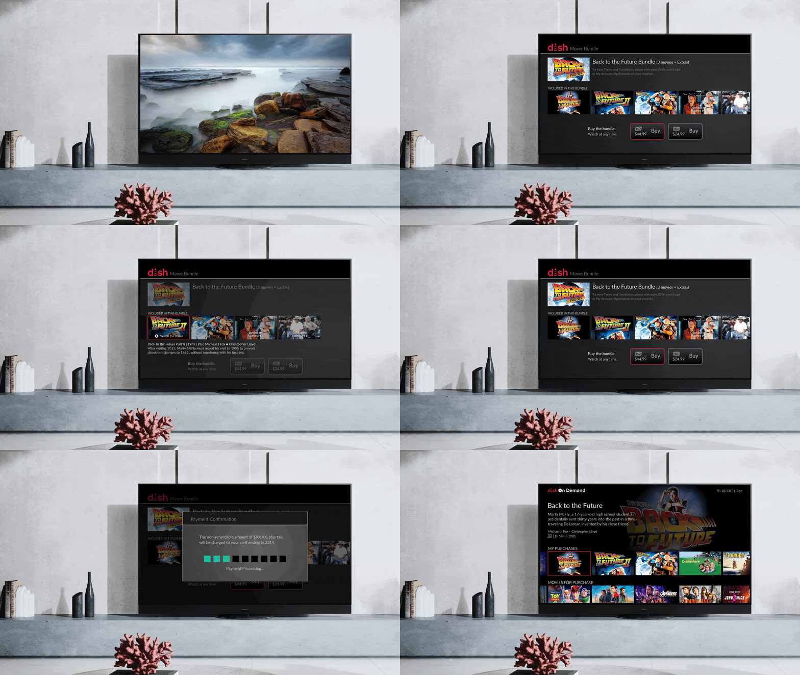
The final design used elements of both the new On Demand and current system merged together to create a bridge in our fractured system. Specifically, this used the new 16x9 cards and shelves used in On Demand while using the current button, background and overall visual style.
Focus on User Expectations
To meet our users expectations, the final design shows individual movie info when highlighted and plays the trailer when selected. Post purchase, the user is redirected back to the On Demand browsing experience, highlighting how purchased content can be found there. Remember, when purchasing a bundle, users do not typically want content to a autoplay post purchase.
Focus on the Funnel
The final version limits the distractions to the user putting focus on their decision to buy and only displays the info necessary to make that decision. Selecting bundle from the "For Purchase" shelf takes them directly to the Buy screen. Previously it would take them to the full Info Card where users would be distracted recommendations and more. Selecting a movie card in the buy screen no longer goes to its full Info Card screen but plays the trailer and returns to the Buy Screen. And lastly, the final version does not promote other bundles or movies for purchase in the Buy Screen.
The learnings from testing Collection Purchasing helped inform the final designs and flows for Single Movies, TV Series and TV Single Episode purchases. This simple and consistent purchase flow will become the foundation as we add additional access points for purchasable content and further promote purchases in the DISH system.
There was little opportunity to reinvent the wheel visually as we were using an outdated design system and visual style. My focus remained on the UX for users, an understandable information architecture and working to simplify the purchasing task. In future iterations, I hope the team will continue to simplify and promote this experience to new users.
